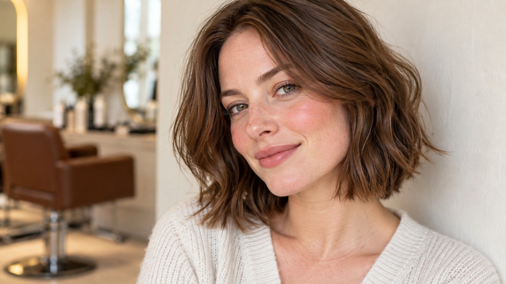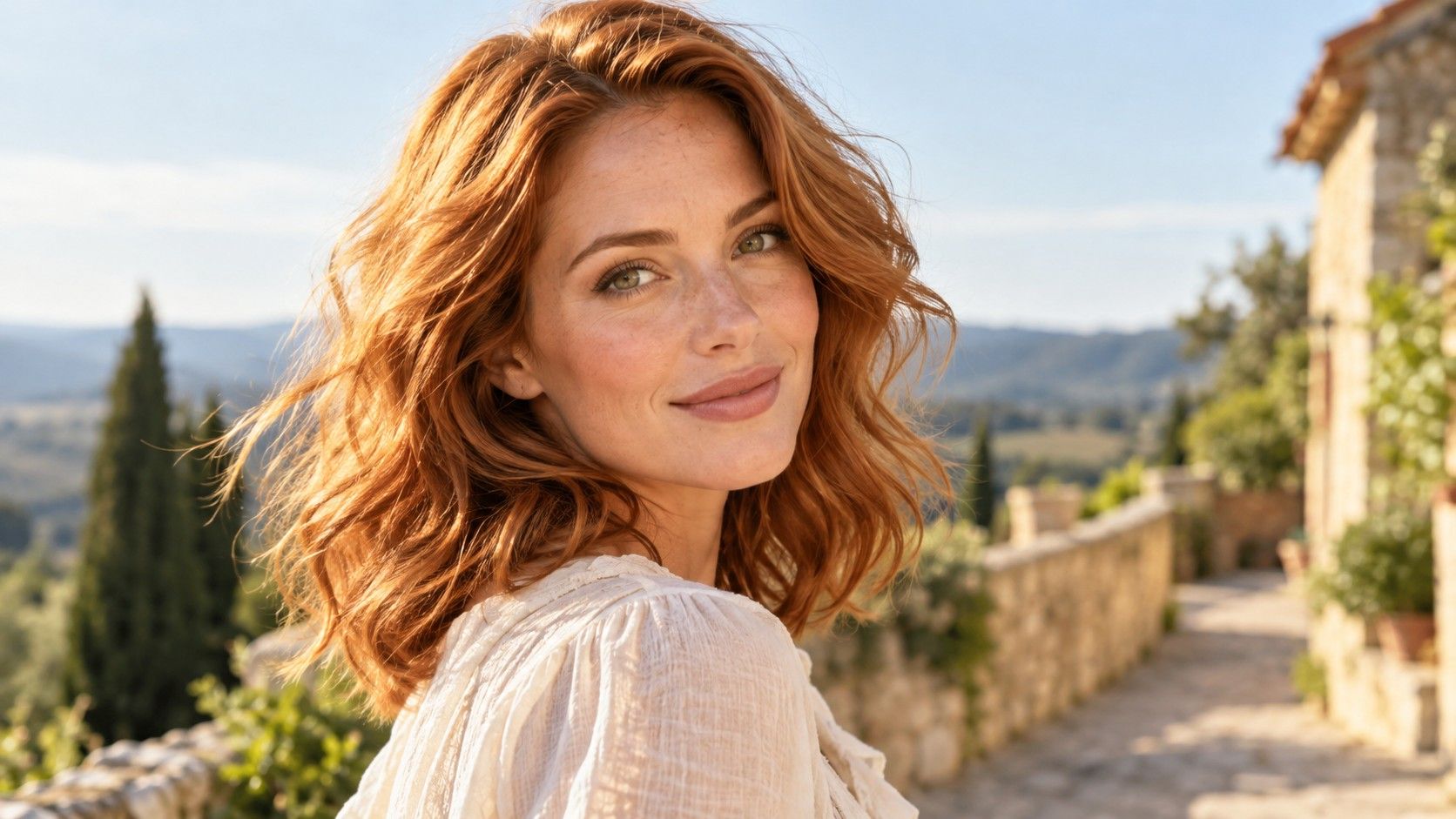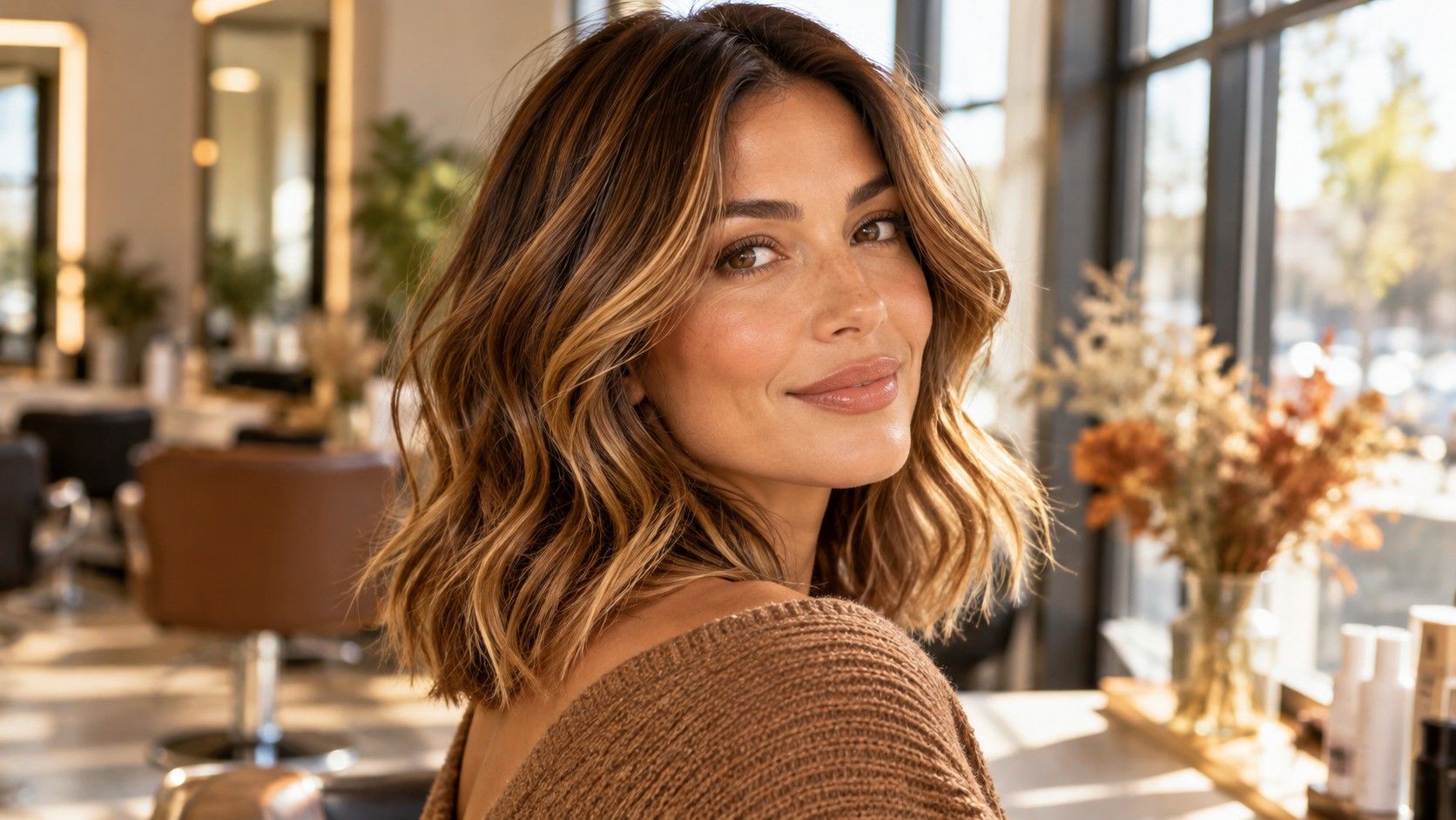
Hair colors for warm autumn skin tones often draw on caramel, chestnut, golden brown and softened copper. These names give you a useful starting range, but they leave several decisions open. Choose how light, how red and how contrasted you want the result to be before asking a colorist for an autumn shade.
Use the autumn palette to narrow the choice without letting it choose for you
Warm Autumn belongs to seasonal color analysis, an optional styling framework that groups colors by qualities such as warmth, depth and intensity. Different systems use slightly different labels. It does not measure the health of your skin, prescribe a dye or prove that you cannot enjoy a cool shade. Its practical value is much smaller and more useful: it gives you a few related colors to compare rather than an entire wall of salon swatches.
The word warm also needs unpacking. A golden brunette, a copper red and a chestnut brown can all be warm, yet they create very different impressions. If you prefer one and dislike the others, the label has not failed. You have learned which kind of warmth you want. Separate the yellow-gold direction from the red-orange direction before you make a decision about lightness.
Begin beside a window with a picture of your current hair and two references at roughly the same depth. One might be a golden brown, the other a redder chestnut. Keep the surrounding clothing plain and avoid changing makeup between comparisons. You are looking for the version you enjoy beside your face, not trying to pass a seasonal test. If the evidence is mixed, that is a reason to keep the change modest.
Choose caramel when you want lightness that still belongs to a brown base
Caramel can describe a soft golden-brown ribbon or a much lighter honey effect. Ask what the word means in the proposed service and inspect an actual swatch or a clear reference. A brunette who wants a little movement may prefer narrow caramel pieces close to the base. Someone seeking a bright transformation may have a much larger contrast in mind. These are different requests even when the inspiration image has the same caption.
Placement helps decide how much warmth reaches the face. Caramel around the forehead is visible whenever the hair is down; a few pieces through the interior show more as the hair moves. Compare both with your usual part. If you tuck one side behind an ear or wear your hair up most days, show that at the consultation. A back view alone cannot explain the daily result you are asking for.
On dark or previously colored hair, lighter caramel pieces may require a different process from a small tonal shift. Do not assume that choosing a natural-sounding name makes the change gentle or simple. Share the history of dark dye, highlights and uneven ends, then let the colorist assess condition and feasibility. A smaller difference from the base can still make the hair look warmer without chasing the palest part of a photograph.
Keep chestnut brown when you like richness more than obvious red
Chestnut is worth exploring if you want brown to remain the main color, with warmth visible where the light catches it. The name varies widely: some examples are nearly neutral, others sit close to auburn. Compare the brightest strands in the reference rather than the shaded interior. They reveal the amount of red or copper that you may notice outdoors.
A medium chestnut can be a more comfortable change than going very dark if you prefer a softer boundary between hair and face. Depth is independent of warmth. You can ask for a deeper brown with restrained warmth, or a lighter brown with a more obvious copper reflection. Avoid accepting a much darker result simply because a picture has the autumn mood you like. Match the depth decision to your natural roots and preferred contrast.
Look at brows as part of the whole face. Very light brows beside a rich brunette create a different balance from naturally dark brows beside the same shade. Neither combination needs correcting automatically. Use references with a similar level of contrast to make your own preference easier to judge. A model with strong makeup may be selling you an entire look when you only intend to change the hair.
Existing lightened ends deserve a separate conversation. Do you want them to remain visibly brighter, or should they blend into the new chestnut? Ask how the colorist plans to handle their different starting condition. A smooth all-over reference may not be a realistic single-step expectation when your hair currently contains several depths and old color bands.
Try softened copper when gold feels dull but vivid red feels too much
A copper direction can bring more visible warmth than caramel or chestnut. For a restrained version, compare a brown-based copper with a brighter orange copper at a similar depth. The first keeps more brown in the overall impression; the second makes red-orange the main event. Words such as muted and soft are helpful only when they are paired with a picture that shows what you mean.
Check the copper under ordinary indoor light as well as daylight. Some references look brown inside and strongly copper outside, which may be exactly what you want. If you expect the shade to remain quietly brown everywhere, however, the outdoor reflection could surprise you. Ask for a realistic explanation of the range rather than searching for a single photograph that claims to show every lighting condition.
You can also limit the copper to selected areas instead of asking for an all-over red. A small warm accent underneath the hair has a different commitment from bright pieces around the face. Discuss whether the placement will still work when you change your part or tie the hair up. Choosing less surface area can reduce the visual impact, although it does not automatically remove the need for professional maintenance.
Check how the warm color will grow and change between appointments
The appealing finish in the salon is only the beginning of the decision. Compare the proposed depth with your roots, including any gray. A near match may create a gentler transition as hair grows; a large difference can make a line easier to see. Ask which part of the result is likely to call for the most attention: root contrast, fading warmth or lighter pieces losing the tone you originally liked.
Warmth can change unevenly on hair with different histories through the roots and lengths. A pale highlighted section may not behave like a darker, previously dyed area. Tell the colorist where you have noticed patchiness or quick fading in the past without trying to diagnose the cause yourself. A strand assessment may be useful, and the plan should reflect the actual hair rather than a generic maintenance schedule.
Be honest about your habits. Frequent washing, regular swimming and a dislike of appointments are practical details, not minor footnotes. Ask what routine the proposed result will need and whether a smaller shift would fit better. Choose any home color-care products with professional guidance for your result; a warm color name alone does not tell you which tint or treatment belongs on it.
If the new shade is part of a longer journey, explain the destination now. Going richer for autumn and wanting to return to a much lighter blonde later should influence the first decision. A future lightening appointment may be more involved after a substantial darkening. You deserve to understand that route before you become attached to the deepest chestnut in the reference folder.
Bring three precise preferences to the colorist
A useful shortlist might contain caramel for placement, chestnut for depth and softened copper for the amount of warmth. Label the detail you like in each image so the colorist is not left choosing between three incompatible finished heads of hair. Add one photo you dislike and explain the specific reason: too orange, too dark at the root, too pale at the front or too uniform through the ends.
Bring a daylight picture of your current hair and explain which parts are natural, colored or lightened as far as you know. State the grow-out you can live with and the time you are prepared to give the result. These are stronger decision tools than a seasonal label because they connect the appearance you want to the starting point and the routine you actually have.
When two warm autumn directions remain equally appealing, favor the one with a clearer maintenance and future-color plan. You can still enjoy the palette without using every part of it. A restrained golden brown, a familiar chestnut or a small copper accent is a complete choice when it gives you the warmth you wanted at a depth you enjoy.