When you try on different hair colors, the useful result is a shortlist you can explain. A preview can help you notice whether you prefer darker framing, softer warmth or lighter pieces near the face. It cannot tell you exactly how dye will behave on your hair. Keep those two jobs separate and the comparison becomes much easier to use.
Start with one ordinary photo that you can reuse
Choose a clear photograph taken in indirect daylight, with your face and most of your hair visible. A plain background helps you inspect the edges around the hair rather than getting distracted by a busy room. Avoid a strong color filter or a portrait effect that changes the face. Your familiar everyday expression is more useful here than the one picture where dramatic lighting does all the work.
The same source photo should anchor every first-round comparison. If one shade appears on a bright outdoor selfie and another on a dim evening portrait, you are comparing much more than hair. Even a different head angle can make the face frame look heavier or lighter. Save the original separately and return to it between options so the edited version does not quietly become your new baseline.
Check the outline before judging the shade. Hair-color previews can spill onto skin, miss pale strands or confuse a dark background with hair. Look around the ears, forehead and ends. If the image has a rough mask or a colored halo, treat the result cautiously. An awkward edge can make a perfectly ordinary shade look artificial, while a smooth edited surface can conceal how much dimension real hair needs.
Read the photo terms before uploading a personal image
Before using an unfamiliar service, check what happens to the photograph. Look for an explanation of whether it is processed locally or sent to a server, how long uploaded images are retained and whether they are used for purposes beyond generating your preview. If that information is absent or too vague for your comfort, choose another route. A hair-color experiment does not require accepting terms you cannot understand.
Check deletion and sharing controls as well. A saved result on your device is different from an image posted to a public gallery, and removing an account is not necessarily the same as deleting every uploaded file. Use the service’s own stated controls rather than assuming that closing a browser tab erases the picture. Keep other people, especially children, out of the image unless their inclusion is necessary and appropriately agreed.
A tight crop can reduce unrelated information in the photograph, such as a visible address, work badge or private room detail. It does not make your face anonymous. If you prefer not to upload a facial image, use held salon swatches or a removable physical option to explore the broad color direction instead. You can still build a useful shortlist without creating a new online photo record.
Change depth first, then compare warmth at the same level
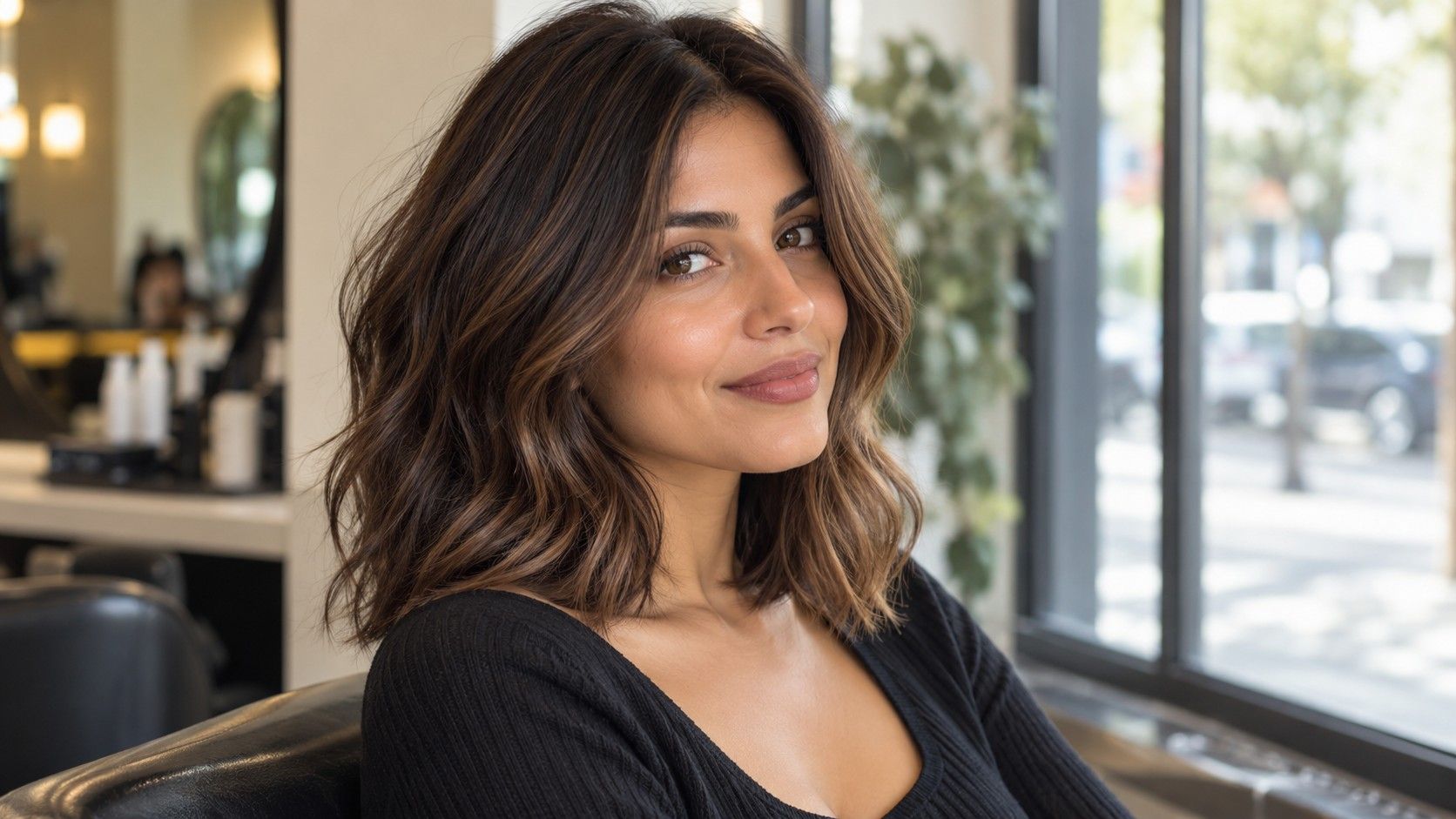
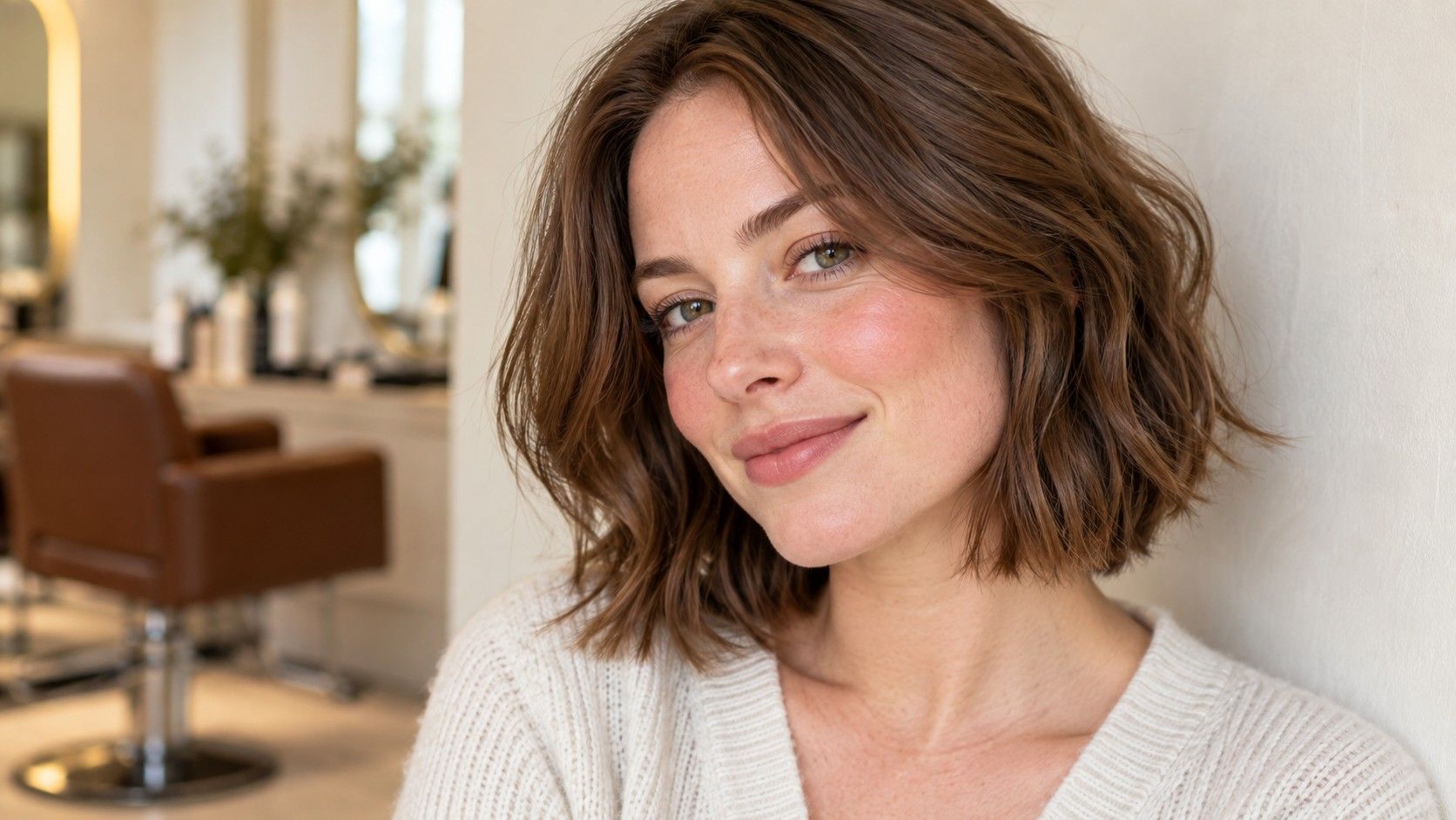
Begin with three broad depths: close to your current hair, somewhat lighter and somewhat darker. You do not need a dozen named shades at this stage. Look at the boundary between hair and face. Does a dark version give the framing you wanted, or does it feel heavier than expected? Does the lighter version soften the effect in a way you like, or remove contrast you wanted to keep?
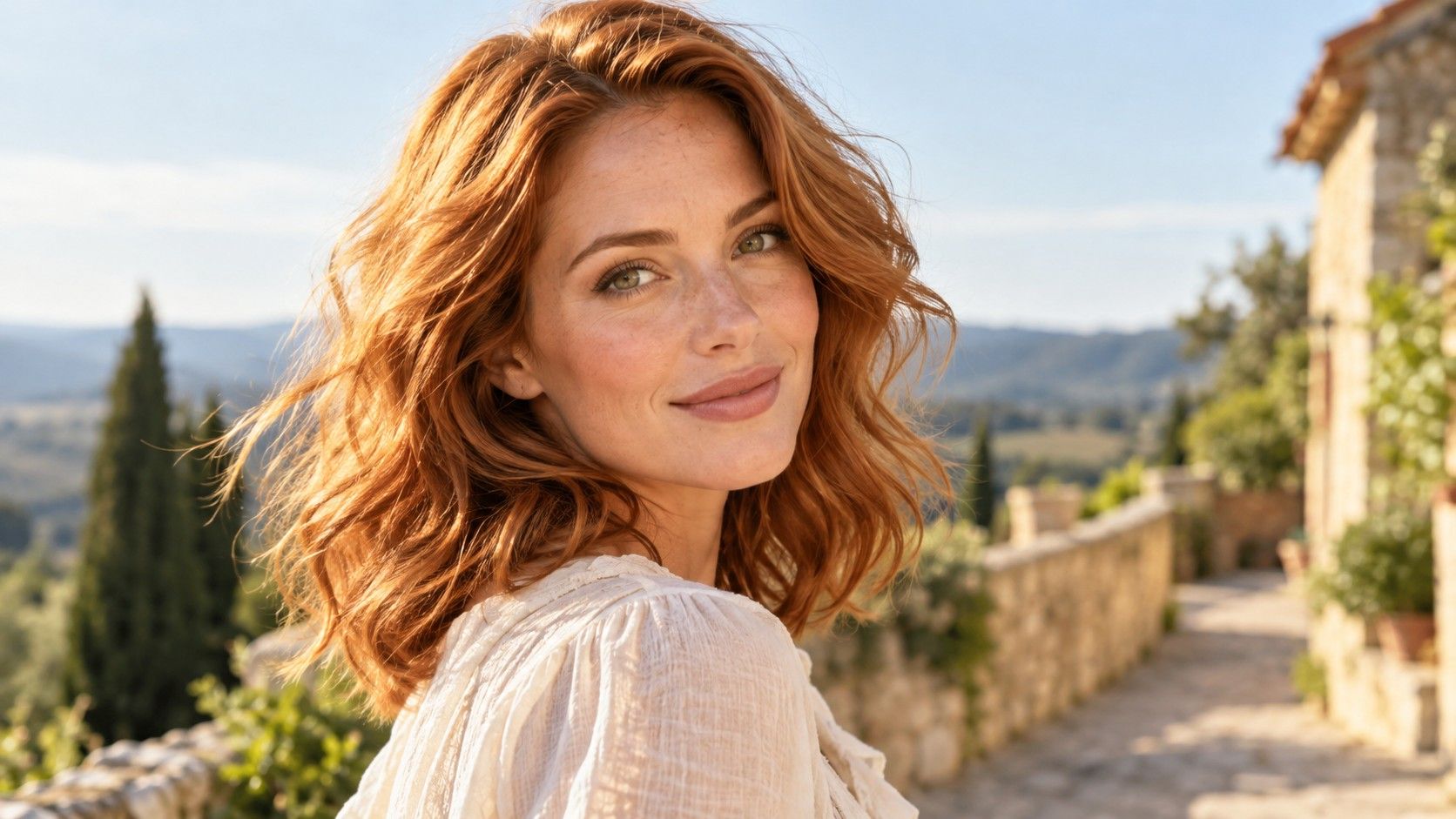
Once a depth appeals, compare a warmer and a cooler version at roughly that same lightness. A warm medium brown versus a cool medium brown tells you more about tone than a pale golden blonde versus black. Note which reflection you enjoy: gold, copper, neutral brown or a cooler smoky cast. These descriptions will be more useful at the salon than the preview tool’s shade name alone.
Put the two edited versions beside the original on the same screen, at the same size and brightness. Disable any optional display setting that changes the screen’s warmth if you can do so consistently. You still cannot turn a phone into a calibrated salon swatch, but you can avoid introducing a different display condition halfway through the comparison.
Write down the response in plain words. Too dark around my face, I like the brown but not the orange, or I want lighter pieces without an all-over blonde are useful observations. A rating without a reason is harder to act on. If two shades tie, keep both and move on rather than trying to force a winner from tiny differences the software may not reproduce accurately.
Check the shortlist on a second photo before choosing a favorite
After the first round, test the same two or three directions on another ordinary photograph. Keep the image reasonably clear, but change a real-life condition: wear your usual glasses, use your everyday part or choose a photo with your hair tied back. This is a separate robustness check after the controlled comparison, not an excuse to compare unrelated images from the beginning.
Look for a consistent preference rather than an identical pixel color. If you like a medium brunette on both photographs but the cooler and warmer versions exchange places, depth may be the strong decision and tone may still be open. Take that uncertainty to the consultation. The tool has helped narrow one variable even if it has not settled all of them.
Also check your favorite with the makeup and clothing you normally wear. A rich red shade paired with a striking lipstick may look appealing in a styled image, but you might want the color to work with your usual bare face and gray jumper too. You are free to choose a dramatic look; simply recognize when it relies on other changes you would need to enjoy making.
Notice the things a convincing preview cannot promise
A digital recoloring does not reveal the route from your existing hair to the simulated result. Old dark dye, highlights, uneven porosity and natural regrowth all influence what a real coloring appointment can achieve. A preview can place pale blonde over dark lengths instantly; that tells you nothing about the condition of those lengths or the number of steps a professional may recommend.
The image also cannot fully show how the color will look through movement and changing light. Real hair has curves, separate strands and areas that reflect light differently. A flat overlay may look like one uniform brown, while real dimension can make a comparable shade feel lighter or more varied. Use the preview to communicate the broad visual target rather than asking for a pixel-perfect reproduction.
Gray hair introduces another gap. A simulated solid color cannot decide whether you want coverage, blending or silver left visible. Those are service and appearance decisions that deserve their own conversation. Similarly, an edited root area does not show how a contrast line will develop as your natural hair grows. Compare the chosen shade with your actual roots before assuming that a convincing screenshot means easy upkeep.
Fading is absent too. The freshly simulated copper may remain unchanged on screen forever, while a real result will change with time and care. Ask which part of the proposed salon result is likely to need refreshing and what routine would support it. A preview cannot supply a universal appointment interval, a reliable chemical formula or a guarantee that you can easily return to your previous color.
Turn the saved images into a clear salon conversation
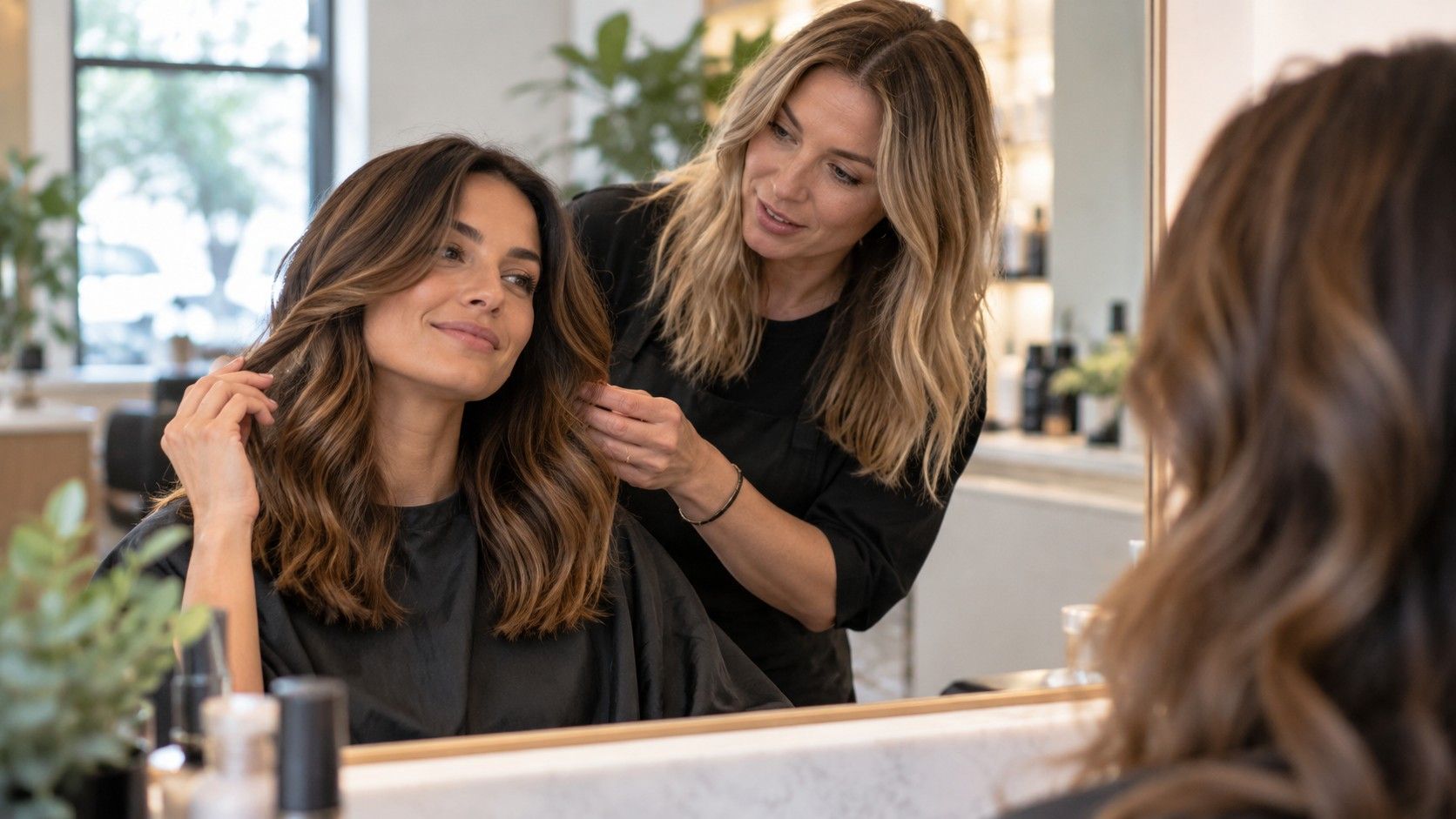
Take your original photograph, the preferred preview and one close alternative. Explain what the first image helped you decide and what is still uncertain. For example, you might have settled on a deeper brown but be undecided between a restrained copper reflection and a neutral finish. That is a manageable question for a colorist who can examine the real hair and compare physical swatches with you.
Add a few real reference photographs showing the desired depth and placement. The simulated image shows the idea on your face; real references help discuss surface shine, dimension and where lighter pieces sit. Neither replaces the starting-hair assessment. Be clear about previous dye and lightening, even when it seems old or is no longer obvious to you.
State your limits in practical terms. You may want to preserve some natural root, avoid frequent refreshes, keep the ends light or retain the option of going lighter later. If the preferred preview would require more change than you want, ask what nearby result is realistic. The shortlist has done its job when it makes that tradeoff easier to see.
There is no need to leave the appointment with the exact shade name from a screen. What matters is that you and the colorist understand the depth, reflection and contrast you are aiming for, along with the work required to get there. A useful preview ends as a clearer decision, with the final coloring plan grounded in the hair you actually have.